Amazon listing images, slot by slot.
Your image stack does more selling than your copy. Here is what belongs in each of the nine slots, the compliance rules that keep your listing live, and real examples worth copying, pulled from live Amazon listings in August 2026.
Get a free listing audit →Slot 1 is a compliant hero shot on pure white that exists to win the click. Slots 2 and 3 carry your strongest infographic and lifestyle image, because mobile shoppers only see the first three without tapping. The rest of the stack answers objections in order: size, detail, comparison, how to use, trust, packaging. Fill at least seven of the nine slots.
Shoppers swipe through your images before they read a word of your copy. On mobile, where well over half of Amazon traffic happens, the image carousel effectively is the listing. Amazon gives you nine slots (one main image plus eight secondary), and each one has a specific job. This guide walks the standard roadmap slot by slot, with real examples pulled from listings that do it well.
The image stack at a glance
| Slot | Image | Its job |
|---|---|---|
| 1 | Main image (hero) | Win the click in search results |
| 2 | Feature infographic | The single biggest reason to buy |
| 3 | Lifestyle shot | Let the shopper see themselves using it |
| 4 | Size & scale | Kill the "how big is it" return reason |
| 5 | Close-up detail | Prove material and build quality |
| 6 | Comparison | Frame the choice in your favor |
| 7 | How to use / what's included | Remove effort and uncertainty |
| 8 | Trust & social proof | Borrow credibility: reviews, tests, certifications |
| 9 | Packaging / unboxing | Set arrival expectations, signal giftability |
Only the first three images show before a mobile shopper has to keep swiping. Whatever most often kills your sale, size doubts, compatibility, skepticism, should be answered in slots 2 and 3, not slot 7. Order by objection, not by template.
Slot 1: the main image
The main image is the only image with hard compliance rules, and the only one shoppers see in search results. Its job is not to explain the product. Its job is to win the click against the six thumbnails next to it.
- Pure white background, RGB 255,255,255. Off-white or light gray reads fine to your eye and still gets flagged.
- Product fills at least 85% of the frame. The sweet spot is 88 to 92%: any tighter looks cramped, any looser wastes thumbnail pixels.
- No text, logos, watermarks, borders or props that are not in the box. Multipacks should show the actual count.
- Real photography of the actual product, not an illustration or a render.
- At least 1,600px on the longest side in practice. Amazon's zoom needs 1,000px, images under 500px are rejected, and 2,000 to 3,000px is the safe modern standard.
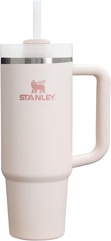
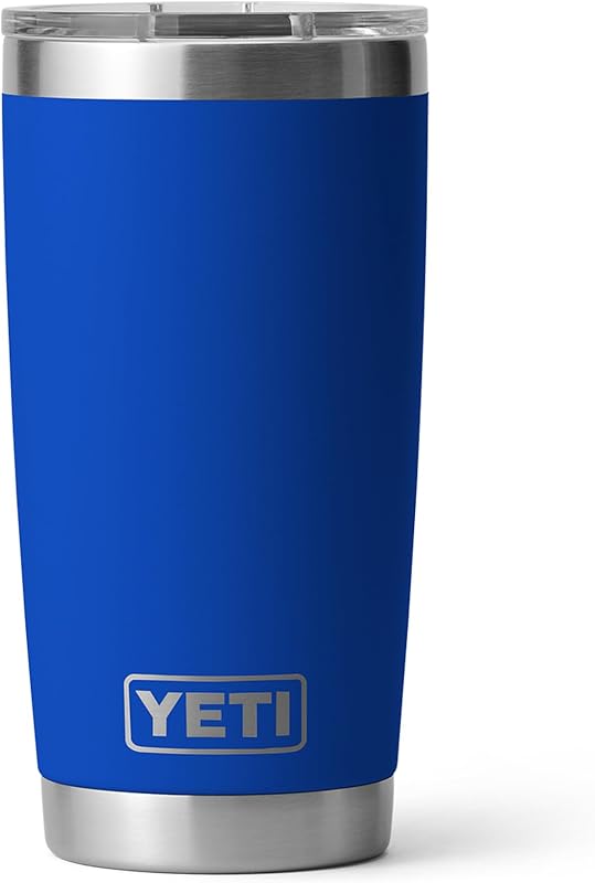
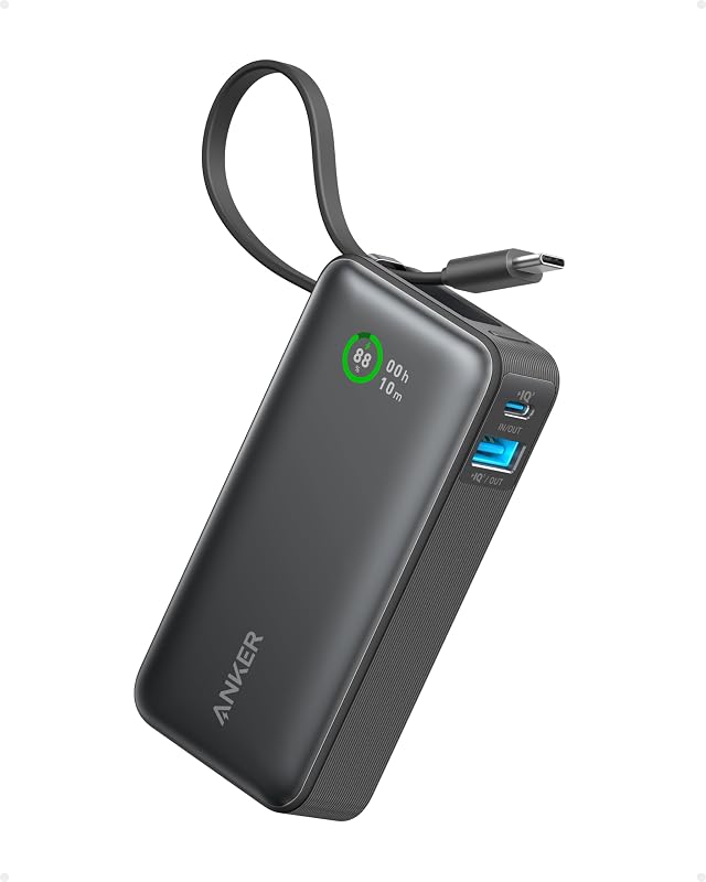
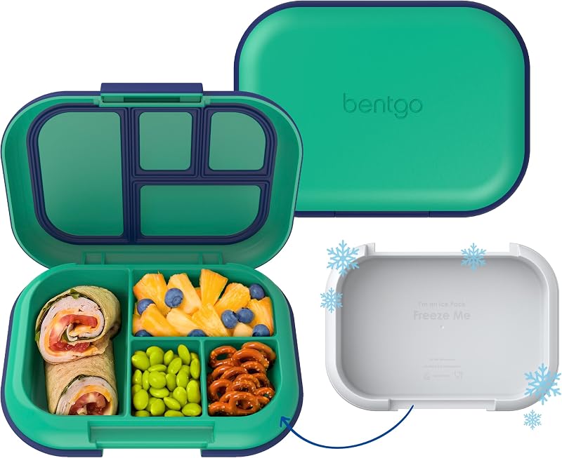
The main image moves click-through rate more than any other asset you own. A/B test it first, and expect angle, orientation and fill changes to move CTR by double digits.
The secondary stack, slot by slot
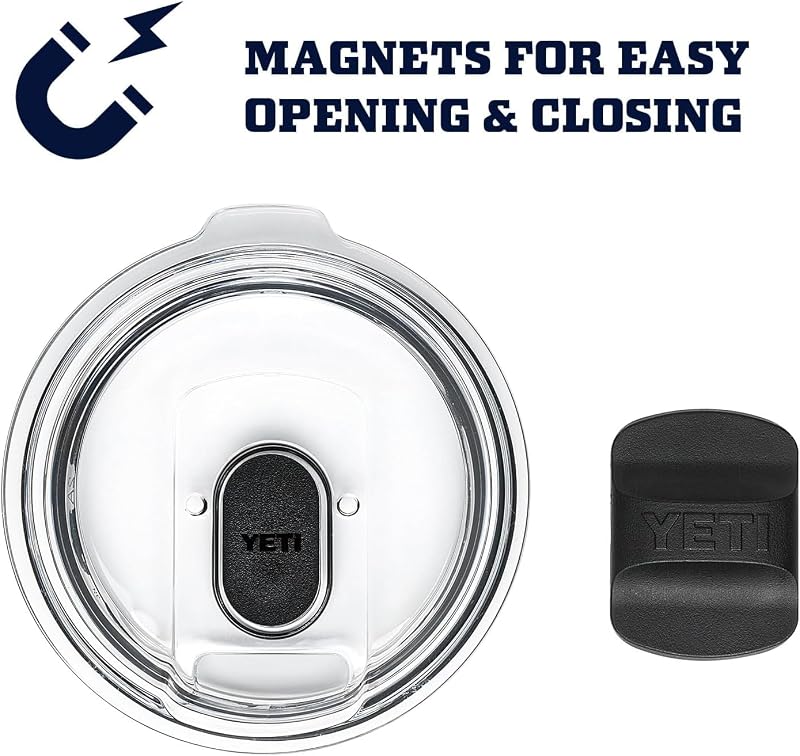
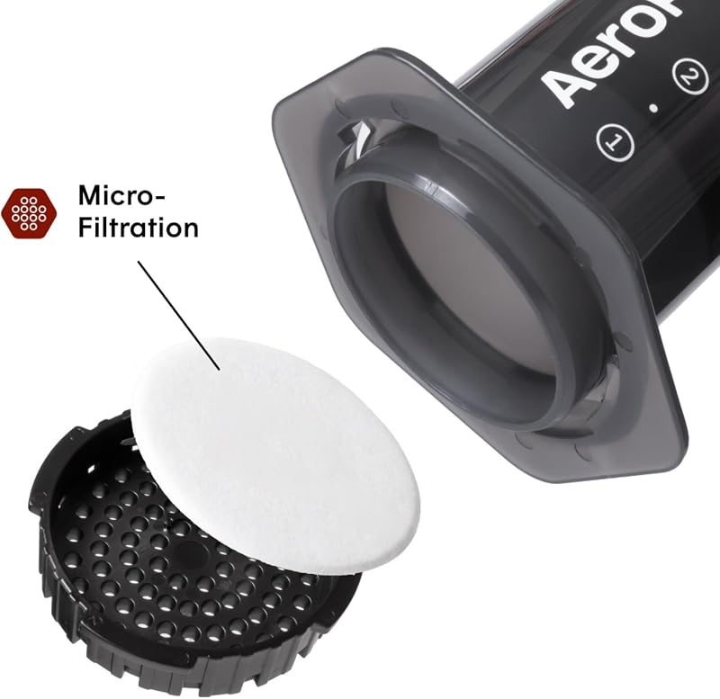
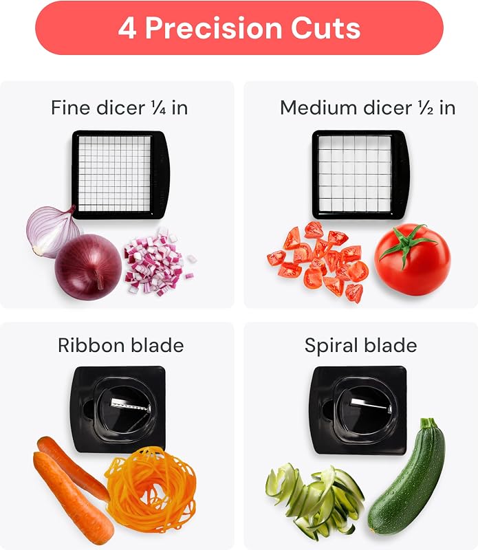
Secondary images have no white-background requirement, and text overlays are allowed. From here on, every image should either advance a benefit or remove an objection.
Slot 2: the feature infographic
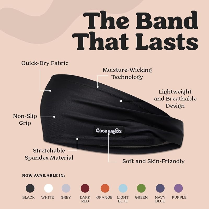
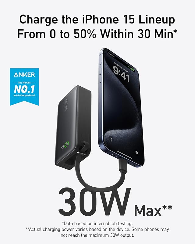
One promise as the headline, three to five callouts as proof, text at roughly 30pt minimum so it survives thumbnail scaling. More than five callouts turns the image into noise.

Slot 3: the lifestyle shot
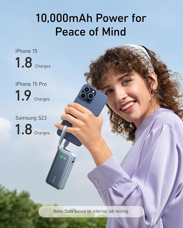
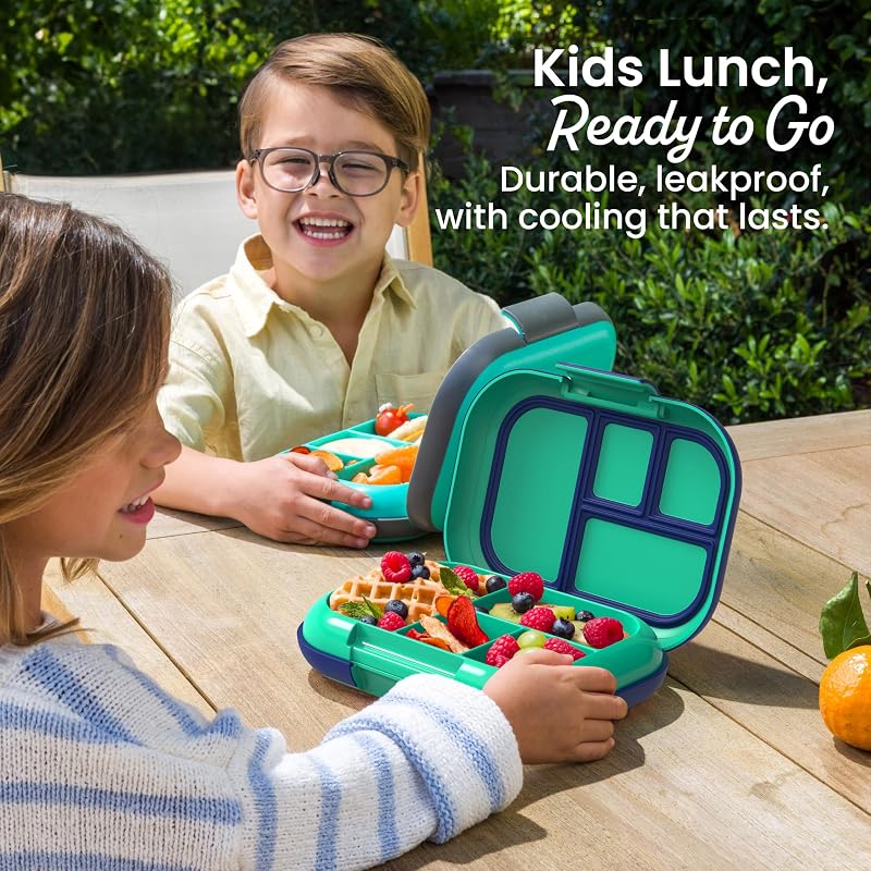
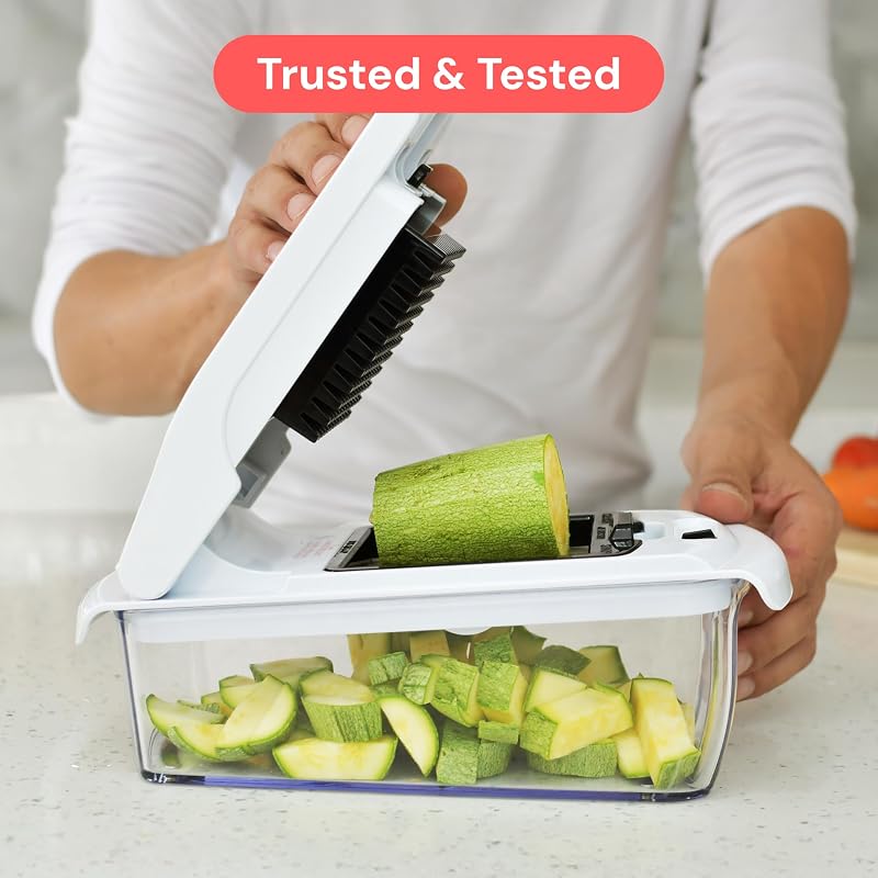
A real person, in the real environment, at the moment the product earns its keep. The shopper should recognize themselves. If your customer avatar is a marathon mom, do not show a twenty-something in a studio.


Slot 4: size and scale
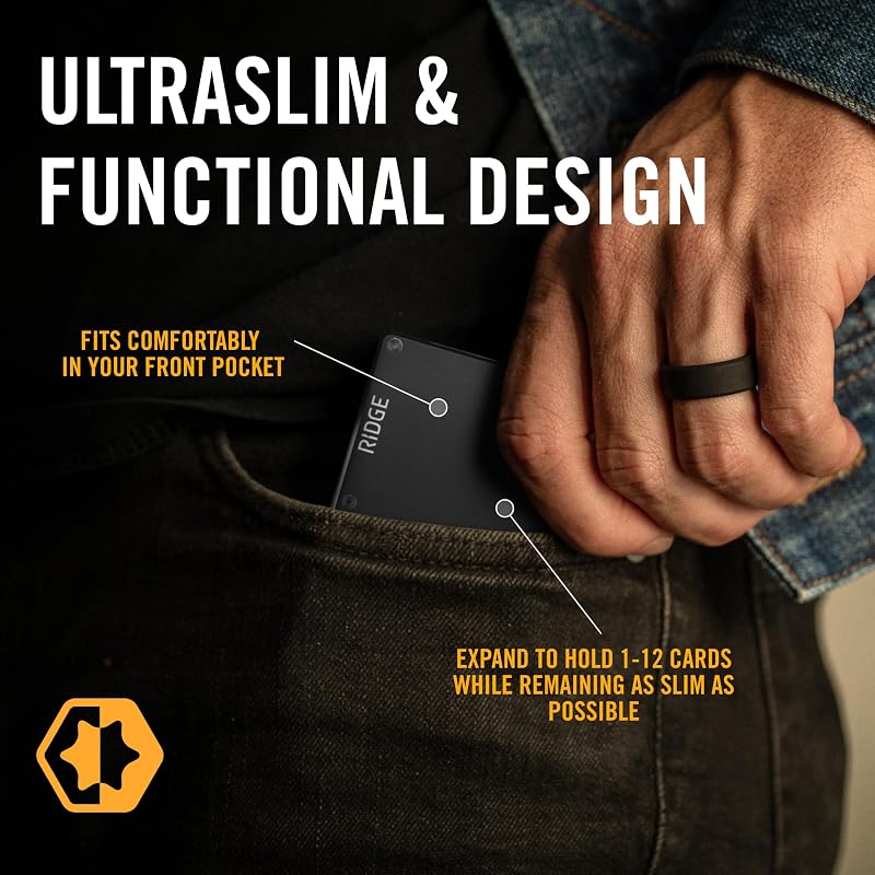
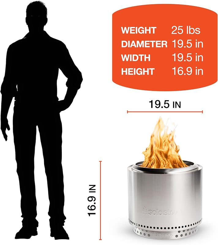
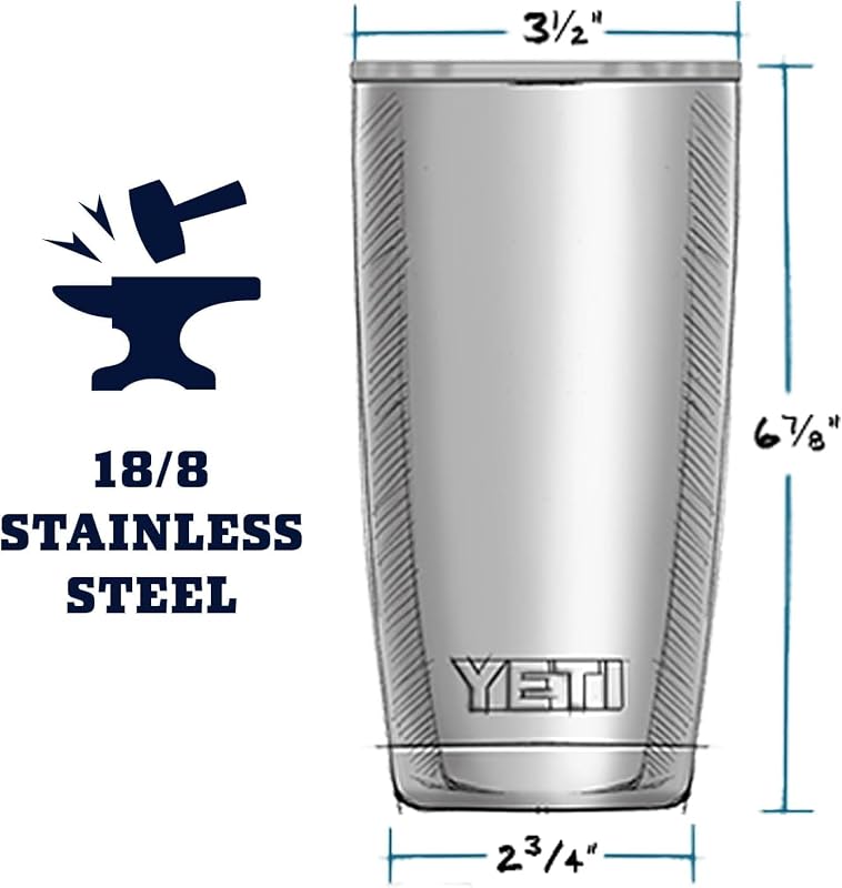
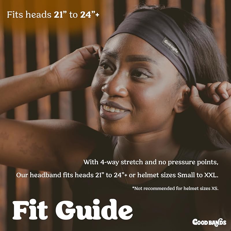
Wrong-size expectations are a top return reason, and returns quietly poison your rank. Show dimensions on the product, next to a person, or on the body.
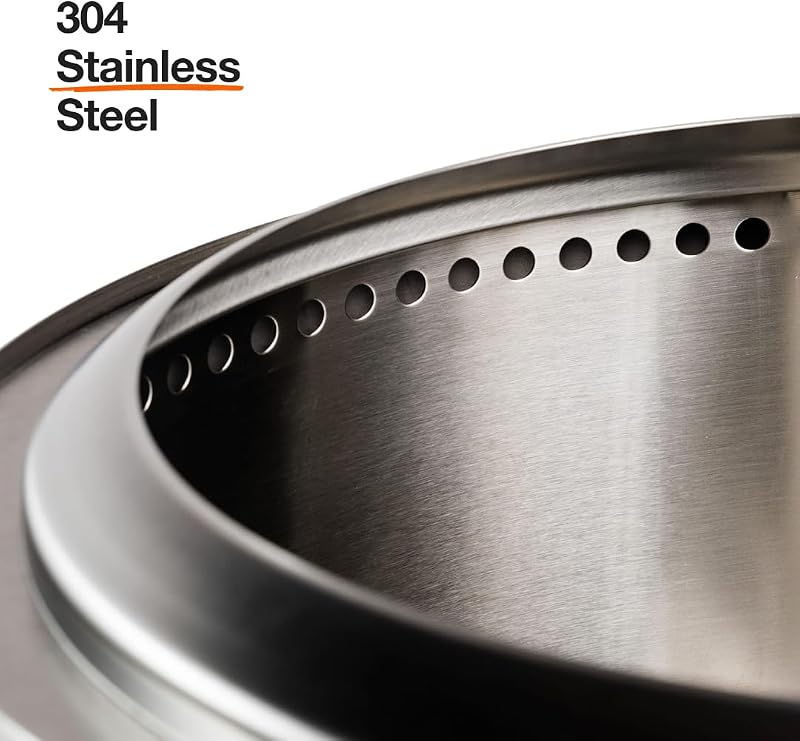
Slot 5: the close-up detail
Zoomed-in texture and construction shots do the work a shopper's hands would do in a store. This is where premium products justify premium prices.
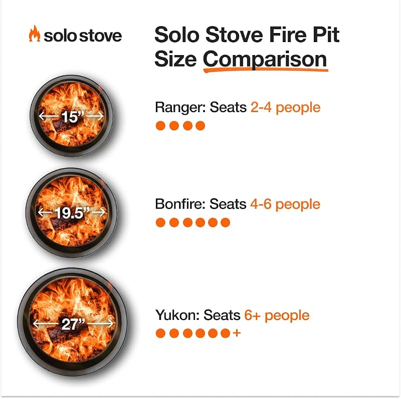
Slot 6: the comparison image
Frame the decision on your terms. Compare against "ordinary" alternatives or against your own lineup, never against a named competitor, which invites takedowns and policy trouble.
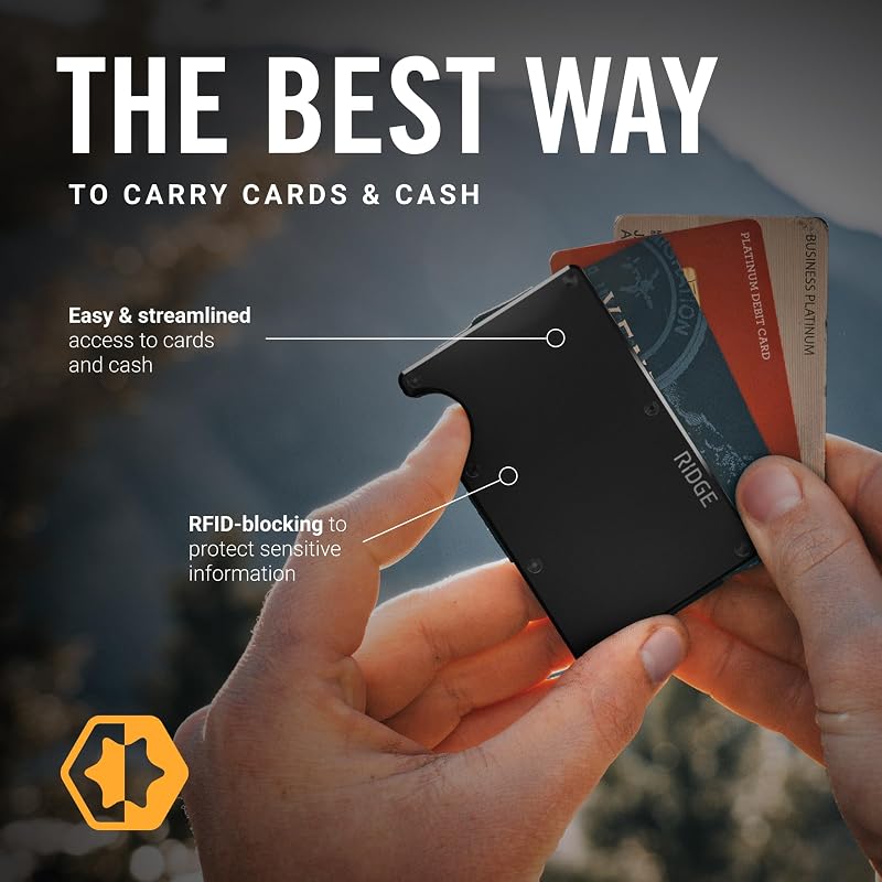
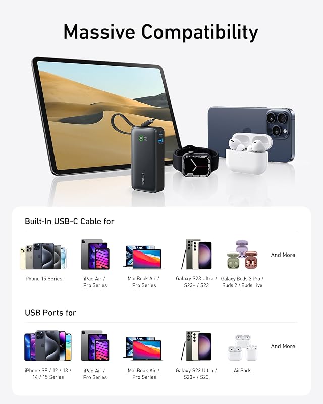
Slot 7: how to use, or what's included
Effort is an objection. Numbered steps make the product feel easy; a flat-lay of box contents makes the offer feel complete and prevents "it didn't come with" reviews.
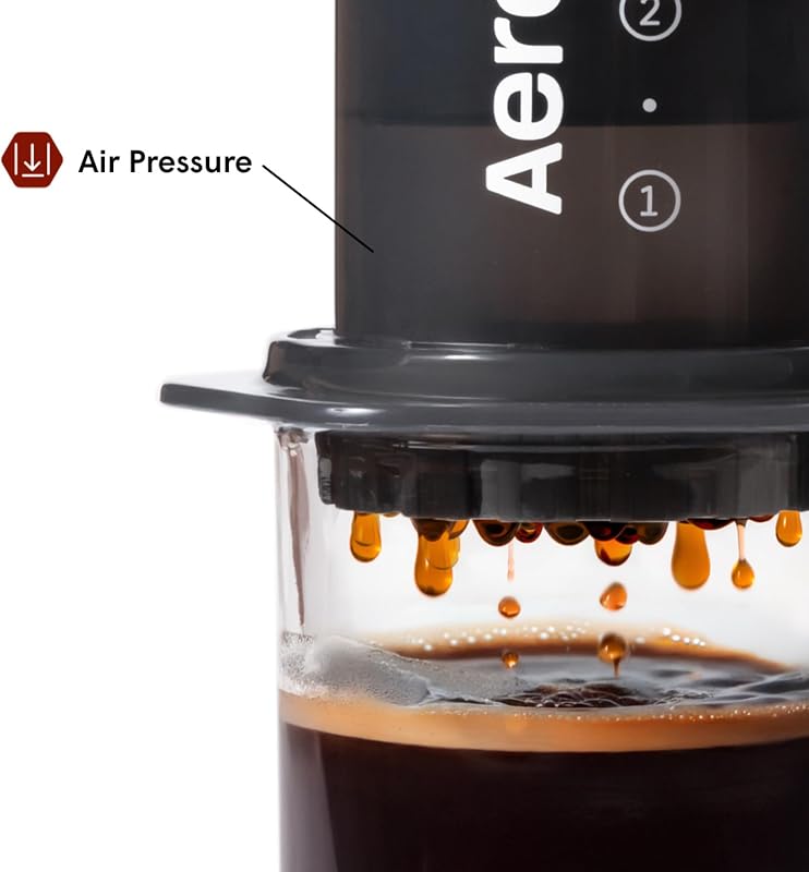
Slot 8: trust and social proof
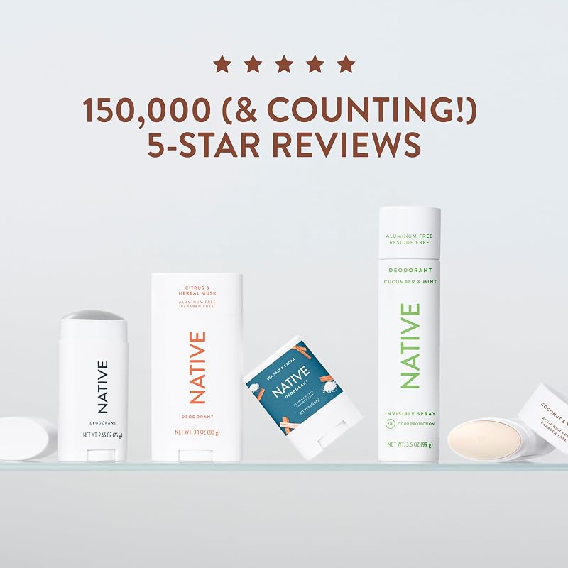
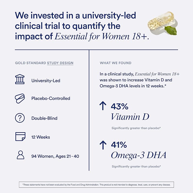
Review counts, test results, certifications, guarantees. Keep every claim true and current, and keep Amazon's restricted phrases ("best seller," "#1," "guaranteed," unverified "eco-friendly" claims) out of the artwork.
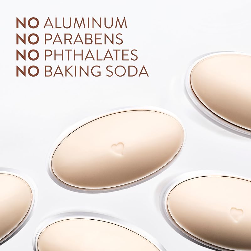
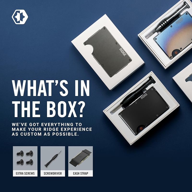
Slot 9: packaging and unboxing
What arrives at the door is part of the product. A packaging shot sets expectations, signals giftability, and gives values-driven brands one more place to differentiate.
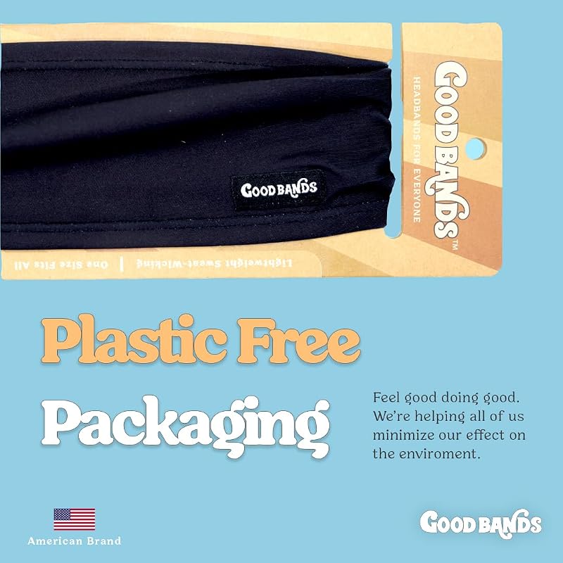
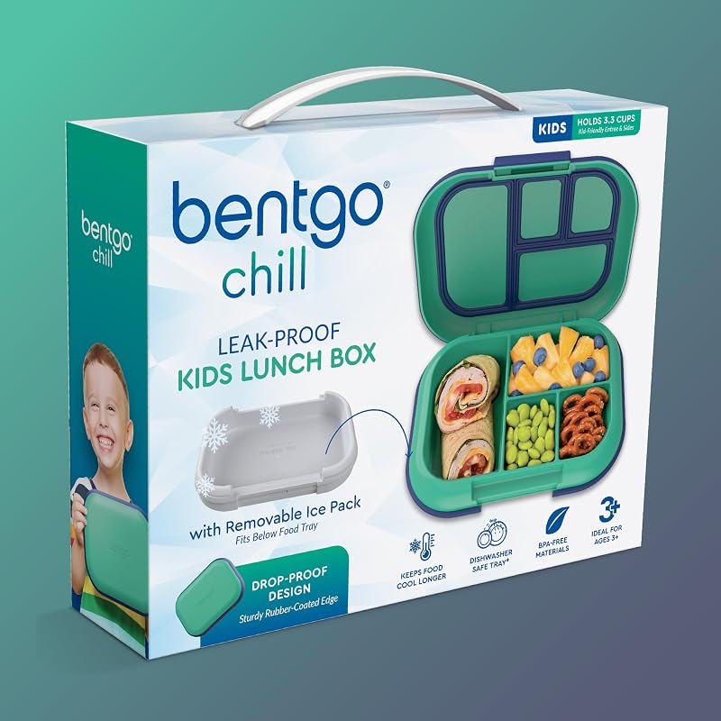
If you have brand video, it occupies a position in the same carousel. A 30 to 60 second demo consistently lifts conversion, so treat the video as part of the stack, not an afterthought.
Sequencing rules that matter more than the template
- Order by objection. The slot list above is the default, not the law. If sizing kills your sales, size moves to slot 2.
- Design for the square. Every image lives in a 1:1 frame. Check every design at 100px wide; if the message dies at thumbnail size, it does not exist.
- Stay visually consistent. One palette, one type system, one lighting style across all nine slots. A coherent stack reads as a brand; a patchwork reads as a reseller.
- Fill seven to nine slots. Fuller stacks consistently outconvert thin ones. An empty slot is a question you chose not to answer.
- Test slots 1 and 2 first. They carry the most CTR and conversion weight. Run experiments through Manage Your Experiments and change one variable at a time.
Compliance quick reference
| Requirement | Rule |
|---|---|
| Main image background | Pure white, RGB 255,255,255 |
| Frame fill (main) | 85% minimum; 88 to 92% is optimal |
| Text, logos, props (main) | Not allowed; show only what is in the box |
| Secondary backgrounds & text | Any background; overlays allowed, keep them legible |
| Minimum size | 1,000px longest side for zoom; under 500px rejected |
| Recommended size | 2,000 to 3,000px longest side, 1:1 square |
| File formats | JPEG preferred; TIFF, PNG, GIF accepted (no animation) |
| Restricted claim language | No "best seller," "#1," "guaranteed" or unverifiable claims in artwork |
Non-compliant main images get listings suppressed from search, often silently. If traffic falls off a cliff overnight, the image stack is one of the first places to look.
Win the click with a compliant hero, answer the three biggest objections in the first three slots, and let every remaining image retire a doubt. Then test, because your best guess is still a guess.
Frequently asked questions
How many images can you have on an Amazon listing?
You can upload nine images: one main image plus eight secondary images. Most detail pages display the first seven until the shopper opens the full gallery, so put your strongest images early. A product video occupies a position in the same carousel.
What size should Amazon product images be?
At least 1,000 pixels on the longest side so Amazon's zoom works, and images under 500 pixels are rejected. In practice, use 2,000 to 3,000 pixels in a 1:1 square frame. JPEG is the preferred format.
Do product images affect Amazon ranking?
Indirectly, and powerfully. Images drive click-through rate in search and conversion rate on the page, and Amazon's ranking algorithm rewards both. A better main image compounds: more clicks, more sales, more rank, more traffic.
Can Amazon secondary images have text?
Yes. Infographics, callouts and comparison charts are allowed everywhere except the main image. Keep text to roughly 30pt or larger so it stays legible at thumbnail size, and avoid restricted claims like "best seller," "#1" or "guaranteed."
Does the Amazon main image really need a pure white background?
Yes, RGB 255,255,255 exactly. Off-white or light gray backgrounds can get the listing suppressed from search results. The product must fill at least 85% of the frame, with no text, logos, watermarks or props.
Ready to get to the top shelf?
A 30-minute call and a free account audit, we’ll tell you exactly what we’d do, no strings.
Get a free listing audit →